Make Sure You Illustrate Well When Preaching
Make Sure You Illustrate Well When Preaching
I’ve addressed the need for good illustrations earlier in this blog. You can check out posts here and here. However, my recent reading has included some reflection on what makes a good illustration. So, in this post we will consider how to make sure you illustrate well when preaching to your congregation.
Adding Design Through Illustrations

Celebration Community Church
A man in the last church that I served full time was a building contractor. He helped several churches as a volunteer. At one point, he was assisting a church where a friend of mine pastored. They had bought an old car dealership, and wanted to turn the building, with its service center and sales offices, into a functional church building. First came the defining how the spaces could be converted. Then came the design. The design involved picking the colors on the wall, the carpeting, how rooms would be oriented, etc. That, my friend said, was the fun part, because it created a reflection on how the building would make an impact.
In many ways, preaching is like the designing of the building. You’ve created the structure, but now you want to help people get excited by how the whole message impacts them. This is why it is important to make sure you illustrate well when preaching a sermon.
Different Ways to Illustrate Well When Preaching
I remember well the first time I reflected on this subject. I was listening to a lecture by Rick Warren on how to preach to unbelievers. In the middle of the lecture he began to share a personal story about his marriage. Suddenly the room became quiet. I noticed that he had everyone’s attention.
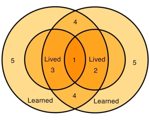
What kinds illustrations have that kind of impact? Haddon Robinson describes well what works in his book, Biblical Preaching. He created a helpful diagram for illustrations. Here it is:

Note first of all that he says we have two kinds of experience: learned and lived. In other words, people respond to truths that they have learned and through what they have experienced through life.
 Level 1
Level 1 illustrations connect on a “lived” level. In other words, you and your audience have had the same experience. These illustrations hit home. They are the best illustrations for connecting your people to your message.
Level 2
The second level is when you’ve learned something that connects with the peoples’ lived experience. In other words, the audience has experienced personally what you are talking about.
Level 3
The third kind of illustration is when what you have experienced, or lived, connects with what people listening have learned, or heard of.
Level 4
When both you and your listeners have learned the same truth, that is the fourth level of illustration.
Level 5
This is where danger begins. When your learned experience doesn’t connect with the audiences learned or lived experience, people will begin to tune you out.
Level 6
Level 6 is when you don’t know what you are talking about, and your hearers recognize that. The illustration you share doesn’t connect with either the lived or learned experience of those you are talking to.
Illustrate Well and Your Sermons Will Make An Impact
Make sure you illustrate well when preaching to your congregation, and you’ll soon gain a reputation for being a good preacher.
I was reminded of this after preaching this past Sunday. I was a guest preacher in a local church, which is challenging, because I didn’t know the people and their lived and learned truth. However, I’ve learned quite a bit in almost 50 years of preaching. Afterward, one woman thanked me for coming and said, “There wasn’t even a cough this morning. We were all tuned in.”
In the next post I’ll give examples of each type of illustration.
Here’s a reflection on where to find good illustrations.


